Some examples, oriented towards social media: Facebook visualisations | Twitter visualisations.
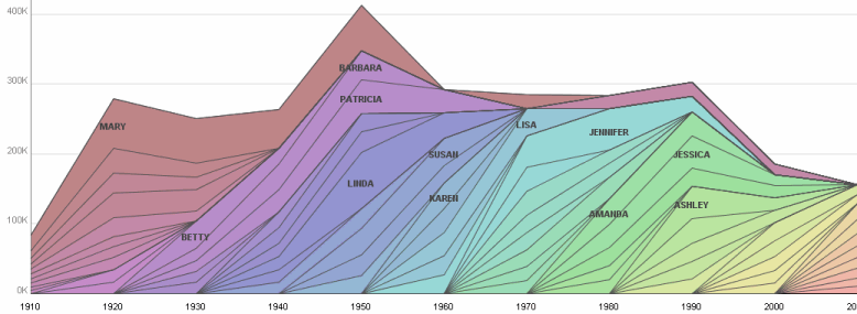
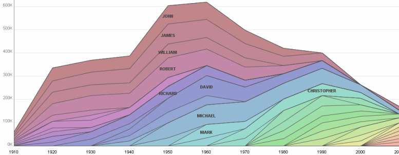
As a visual example, the following graphs show how the top 10 girls names, and the top 10 boys names change over time.
Check out how the girl's names appear to go "out of fashion" more quickly!


It's a cool graph. Can you please guide me how did you make it? I have used Many eyes tool but do not know how to control the scales etc. Early response will be appreciated!
ReplyDeleteBest,
SN
The data set is on the "Many Eyes" web site - called "Top 10 baby names from 1910 to 2010 per decade grouped by male and female". I've put the link in the post.
Deleteglassagram
ReplyDeleteallsmo
instagram gizli hesap görme
revelio
bestwhozi
ZJY1
dfdvgdcgvbcgfhfgjh
ReplyDeleteصيانة افران الغاز بجدة
wsedadsadsfsd
ReplyDeleteصيانة افران الغاز بجدة